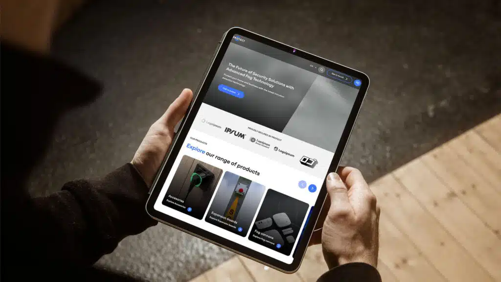
A new website with a modern, user-friendly design for a better customer experience. The website focuses on a more organized and intuitive information structure
LOBPA is a non-profit organization that offers assistance and professional counseling to people with severe disabilities. The organization also serves as the foundation for a unique social community that shares helpful experiences and creates new experiences together.
LOBPA’s services are based on the Independent Living movement. This means that the organization works towards a free, independent, and equal life for its members – regardless of disabilities.
As an impactful and meaningful national organization, LOBPA required a new website that would better align with its new visual identity. Also, the organization needed a website that was easy to navigate and would offer a better user experience with a modern, up-to-date design.
Consequently, LOBPA contacted Twentyfour and asked for our help with a new and modern website that focused on the organization’s vision. The website should improve user experience by providing intuitive and user-friendly interfaces.
The task was to build a new visual identity and ensure that the new website was modern and user-friendly
LOPBA had already spent time on workshops with a previous agency, which meant that the organization was quite clear on what it wanted – and that made our first workshop with LOPBA relatively short and effective. During the workshop, we discussed the desired implementations according to the organization’s values, which clearly understood the client’s needs and visions.
The next step of the process was then the actual implementation. The overall design process was relatively quick and agile as we had quite a short time frame to deliver the new design in.
Twentyfour promised to deliver the following changes:
- Improve the user experience (UX) for various stakeholders.
- An intuitive and appealing menu system for the stakeholders.
- Implementation of the new colors according to the new design.
- Ensure that the new website is modern and future-proof, following best practices.
- Integrate NemTilmeld through our integration platform, KOEBT.
The project
The new website for LOBPA was created in WordPress because it is a platform that is efficient and easy to use, allowing LOBPA’s employees to make changes and customize the pages according to the vision and message the organization wants to send. The website is fast and responsive on all devices – desktop, mobile, and tablet.
LOBPA provided us with a design guide with essential details, and then we proposed wireframes for the project’s pages. After that, the design was forwarded to our developers, and we started to implement the plan in WordPress.
The development of the website was straightforward and only saw minor adjustments throughout, which ensured that we could deliver the project and get the website live quickly.
Furthermore, Twentyfour integrated the website with NemTilmeld through our integration platform KOEBT. The perks that come with integrating existing systems with new ones are minimizing human errors and saving resources.
This way, we fetched events from NemTilmeld and displayed them on the website so that users would only have to visit lobpa.dk to see upcoming events instead of visiting multiple sites.


